Email isn’t just another channel—it’s the channel. With an average ROI of $36 for every…

How to Create Compelling Calls-to-Action for Your Email Campaigns
Crafting an effective email campaign goes beyond the content itself. The true power lies in how you drive your audience to take action. A well-designed Call-to-Action (CTA) is a crucial element that can significantly influence your campaign’s success. According to HubSpot, emails with a single CTA can increase clicks by up to 371% and sales by 161%. Whether you’re a startup, an established brand, or a large enterprise, mastering how to craft CTAs can transform your email marketing efforts.
1. Understand Your Audience
Before crafting your CTA, you must know who you’re speaking to. Different segments of your audience may respond to various types of CTAs. For example, a B2B audience might prefer straightforward, professional language, while a B2C audience might respond better to more playful or urgent CTAs.
Actionable Tip: Use data analytics to segment your audience based on their behaviour, purchase history, and engagement level. Tailor your CTAs to align with these insights.
2. Be Clear and Concise
The most effective CTAs are those that are easy to understand. Avoid vague language like “Click here” or “Submit.” Instead, be specific about what the user will get by taking the action. For instance, instead of “Learn More,” use “Download Your Free eBook Now.”
Actionable Tip: Keep your CTA text between 2-5 words. A concise, action-oriented CTA is more likely to catch the reader’s attention and encourage them to act.
Read more related articles: A/B Testing in Email Marketing: What You Need to Know
3. Create a Sense of Urgency
Urgency can drive immediate action. Phrases like “Limited Time Offer” or “Only a Few Spots Left” can push your audience to act quickly. According to a study by Campaign Monitor, CTAs that convey urgency can improve conversion rates by up to 22%.
Actionable Tip: Incorporate time-sensitive language in your CTA. For example, “Get 20% Off – Today Only!” or “Reserve Your Spot Before It’s Gone.”
4. Use Strong, Action-Oriented Language
Your CTA should inspire action. Words like “Get,” “Start,” “Try,” or “Join” are powerful triggers that compel users to click. These verbs instil confidence and a clear sense of purpose.
Actionable Tip: Test different action verbs in your CTAs to see which resonates best with your audience. Tools like A/B testing can provide insights into which language drives the most engagement.
5. Design Matters
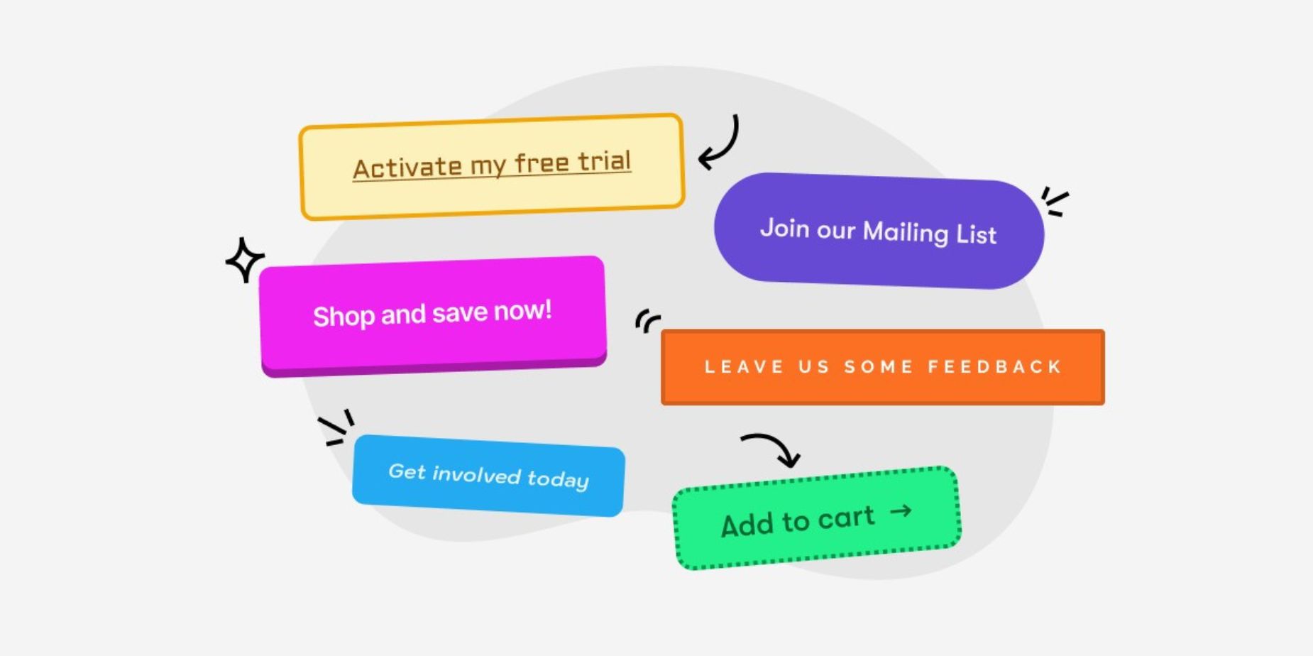
A compelling CTA isn’t just about the text; the design plays a critical role too. Your CTA button should stand out visually from the rest of the email. Use contrasting colours, ample white space, and a size that makes the button easy to click, even on mobile devices.
Actionable Tip: Ensure your CTA button is mobile-friendly. With nearly 46% of email opens occurring on mobile devices (Litmus, 2024), your CTA should be easily tappable on a small screen.
Read more related articles: How to Use Automation in Email Campaigns for Better Efficiency
6. Placement is Key
Where you place your CTA can impact its effectiveness. While it’s common to place a CTA at the end of an email, consider adding one near the top as well, especially if the email is lengthy. This gives your audience multiple opportunities to act without having to scroll.
Actionable Tip: Experiment with placing CTAs in different parts of your email to see which location yields the highest click-through rates. HubSpot suggests placing a CTA above the fold can increase visibility by up to 84%.
7. Test and Optimize
The most successful marketers know the power of testing. A/B testing your CTAs can provide valuable insights into what works best for your audience. Test different colors, text, sizes, and placements to see what drives the most conversions.
Actionable Tip: Use tools like Google Analytics or HubSpot’s A/B testing feature to analyze the performance of different CTAs. Make data-driven decisions to optimize your email campaigns continually.
8. Align CTA with Your Offer
Your CTA should align perfectly with the content of your email. If your email is offering a free trial, your CTA should reflect that—something like “Start Your Free Trial Now” is clear and directly related to the offer.
Actionable Tip: Ensure the CTA is contextually relevant to the email content. A mismatch between the offer and the CTA can confuse your audience and reduce click-through rates.
Conclusion
Creating compelling calls to action is both an art and a science. By understanding your audience, using clear and strong language, incorporating urgency, and continuously testing, you can craft CTAs that drive engagement and conversions. Remember, a well-placed, well-designed CTA can be the difference between a missed opportunity and a successful email campaign.
Implement these strategies into your next email campaign and watch your click-through rates soar. Whether marketing to businesses, startups, or large enterprises, these actionable insights can help you achieve your marketing goals.
Read more related articles: How To Use Data Analytics to Improve Your Email and SMS Campaigns


